Double Your Leads Without Doubling Your Website Traffic
Is there anyone that doesn’t want to double the number of leads and opt ins you’re currently adding to your list? I bet you think you have to double your website traffic to do this, and that costs money.
Have you ever wondered if you could actually double your subscribers with your existing web visitors? All you need is a lucky coin, the age of Aquarius, and avoid crossing the path of a black cat.
OK, so that is a little hocus pocus fantasy. So what’s the real secret to getting more opt ins on your customer and lead lists?
The real “trick” is focusing your marketing efforts on improving your conversion rates with your existing traffic. Ever notice how I keep changing my offers, banners and opt in blocks? All the top marketers constantly test and evaluate to improve conversions.
As my top testing “adviser,” Ryan Deiss says, “While this strategy is no big secret, it’s amazing often it is overlooked.”
The single most effect, and absolutely free way to get more opt ins, is to tweak your current message and change various things on your website.
The question is where do you start?
Well, let’s start with the obvious, or what should be obvious but isn’t because of the number of websites I see doing the very WRONG thing.
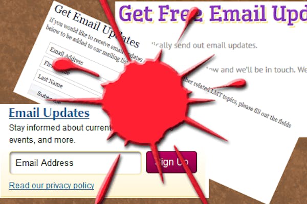
The sidebar or lame subscription request
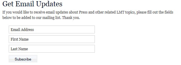
Ever signed up for this?
Do you do this? Ask people to sign up for email updates as lame as you see in this image? If so, there is no wonder you can’t get anyone on your list. Who the heck is going to sign up just so you send them junk email? 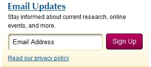 Seriously, have you ever felt compelled to sign up in such a lame request? Don’t lie. You know you haven’t.
Be creative. Dress up your opt ins. I don’t claim perfection, but I would never be hoping for opt ins in a lame request like this. And this is a REAL website example.
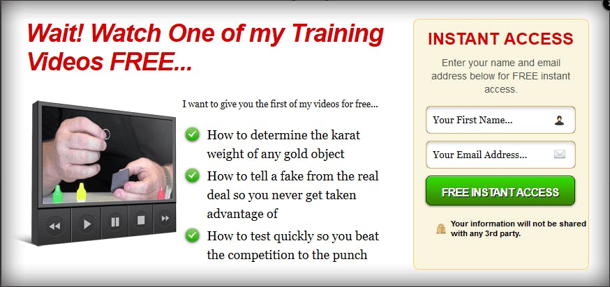
The Easy Solution
What’s the easy solution? Dress it up and give away something of value. You know, something people visiting your website would actually want. This should not be a mystery. The next image is an example of a catchy opt in. It has the bold headline, a quality free offer, and a big promise of the offer. I know you can do this, so what’s stopping you?
Wouldn’t You’d Rather Have This?
See the obvious addition? You might even be wondering right now how you can get this. Well, that’s the point. See what I’m talking about?
Add a Warning Pop Up
Yes, I can hear you now shouting, “those are annoying, I’ll never use those!” OK, so don’t, and don’t increase your opt ins. The way to use these java script pop up warnings is to have them “pop” when people click images. I do heat map and click tracking of pages. Do you have any idea how often your visitors click on images? It’s like nearly all the time.
So add a pop java script connected to the image on your opt in or squeeze page to remind visitors to opt in before they leave. Don’t be lame when you do this either. Be cute, be attention grabbing, be funny, but don’t say, “Opt in for email” or anything lame like that.
2 More Secret Strategies Unlock Below
Shorten up Your Squeeze Pages
You might believe that long squeeze pages with lots of bullets and pictures do better than short simple ones with text. Sorry to knock you in the belief locker. As Deiss iterates, and reiterates;
We’ve tested this in 12 different markets on over 100 sites, and short-form, unbranded squeeze pages outperformed other in almost every case. There were a couple of exceptions, so it’s something you’ll want to test in your own market.
The emphasis is on test in your market. It is more likely than not, the unbranded, short-form is going to out perform the fancy, long-form with lots of text, pictures and bullets.
Why do so many not do the short form? I think it is a fact of life. People do what everyone else is doing without any evidence it works. They fear being the contrarian, and don’t want to test. So which will you be?
How About the Feature Box Opt In?
As of writing this article, I have not done this, but you will see me do it soon: use the feature box for a opt in/giveaway for list building. Once again, Deiss has tested this repeatedly, and the feature box is more effective when re-purposed as an opt in box instead of showing featured images. The numbers don’t lie, but your brain and my brain will lie to us. Go with the numbers.
As always, test this; and test it with varying offers. Don’t put up just one and decide it doesn’t work because your first offer flopped. Tweak it, and try again.
OK, that’s enough to keep you busy. The bottom line here is there remain many more things you can do to optimize for conversion. By testing and tweaking, you can easily double your conversions with your existing traffic and not spend a dime.
If you take the time to figure out what your audience wants, they will take it, and they will opt in for your list.
So what’s your best optimization tip? Share with us in the comments.
International speaker, author, and entrepreneur. Retired navy officer, former commanding officer. Over 35 years of leading, coaching, mentoring, and speaking.